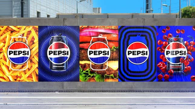
For a product as global and full of history as Pepsi, a brand refresh was never just going to involve a new can design. Still, even by those standards, the company’s newly unveiled makeover has a whole lot going on.
We Try (and Fail) to Guess the MTN DEW Mystery Flavor
Pepsi’s press release explains this is the first time Pepsi has changed its logo and overall “visual identity” in 14 years; the change is part of the brand’s 125th anniversary celebration. The new logo will debut in North America this fall and go global in 2024.
“At PepsiCo, we design our brands to tell a compelling and holistic story,” said Mauro Porcini, Senior Vice President & Chief Design Officer of PepsiCo. “Pepsi is a shining example of a brand that has consistently reinvented itself over 125 years to remain a part of pop culture and a part of people’s lives.”
A brief history of Pepsi
One thing Pepsi has not been shy about in recent years is trying out interesting flavors, whether as limited-time promotions or as permanent additions to its lineup. Nitro Pepsi, the brand’s nitrogen-infused cola that debuted in 2022, was a project years in the making. It wasn’t to our liking, but it was certainly a bold departure from the brand’s other offerings. There was also the addition of Pepsi Mango in 2021, which came as a welcome surprise after five years without a new permanent flavor.
G/O Media may get a commission
In addition to the evolution of the brand’s logo, Pepsi has had a number of interesting collaborations play into its recent history as well. There was Pepsi x Cracker Jack, which was released as a seasonal drink to coincide with baseball season. There was also a spring 2021 collaboration with Peeps to create PEPSI X PEEPS (a drink that absolutely should have been called Peepsi). Plus, although I’m sure Pepsi, and all of us, would rather forget the whole Kendall Jenner “Live For Now” commercial, that did happen, and it was certainly a high-profile collab. And don’t even get us started on Pilk, the 2022 holiday promotion from Pepsi that encouraged everyone to pour milk into their soda.
Obviously, brand collaborations and limited-time promotions play key roles in Pepsi’s marketing strategy—and based on some of the design choices seen in the new logo, those partnerships will continue to be important.
Breaking down Pepsi’s new logo and can design

The new logo has a number of purposeful distinctions from the previous one. While the Pepsi “globe” continues to have the red, white, and blue color palette, the brand name has been added to the center in bold black type, similar to how it was placed on cans in the 1970s and 1980s. (Who doesn’t love a subtle throwback?)
The black lettering, meanwhile, is meant to be a visual reminder of the brand’s sugar-free offering, which highlights the same color scheme. The company notes this as part of its “commitment to Pepsi Zero Sugar in the future.”
The “Pepsi pulse”—the signature ripple outward from the logo—is a key feature Pepsi wants to highlight in this latest design. The company describes this pulse as evoking “the ‘ripple, pop and fizz’ of Pepsi-Cola with movement,” in addition to calling to mind Pepsi’s history with rhythm and music, including the Super Bowl Halftime Show. Based on promotional images provided by Pepsi in the press release, it would appear that the pulse creates a customizable canvas for future collaborations, too. Mauro Porcini, Chief Design Officer at Pepsi, told Fast Company that the next decade of advertising will feature animations of this pulsing logo.
Here’s how the press release describes it:
In an increasingly digital world, the revitalized and distinct design introduces movement and animation into the visual system, unlocking more flexibility for Pepsi to move between physical and digital spaces, from retail shelves to the metaverse. It also allows for more seamless and creative collaboration with partners and retailers and more versatility to engage fans in the places they shop, dine, work and play.
Notably, the press release also uses the word “unapologetic” no fewer than five times, describing the new logo as boldly unapologetic and referencing consumers who unapologetically enjoy drinking Pepsi. The new typeface is, the press release notes, a reflection of this “unapologetic mindset.”
We’re fans of the new logo, but not really for any of the reasons Pepsi wants us to be. Instead, we simply appreciate that it’s a modern update that still brings a sense of nostalgia. Lowercase letters are so 2009.

